Why a Mobile-First Lawn Care Website Is No Longer Optional
Homeowners search for lawn care on their phones. If your site does not treat mobile as the main experience, you are competing with one hand tied behind your back.
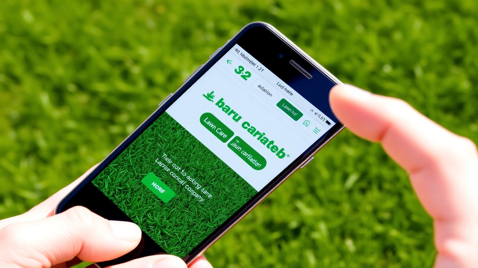
There is a small, persistent myth in the home services industry that desktop websites are still the priority. The thinking usually goes something like this: 'People are at their desk when they research a service.' It is a comforting idea and it is completely wrong. Roughly three quarters of the traffic to a lawn care website today comes from a phone. If your website was designed as a desktop experience and then shrunk to fit a mobile screen, you are losing jobs to competitors whose sites were designed the other way around.
What does mobile-first actually mean?
Mobile-first is not just responsive design. Responsive design was the previous generation. It said: build for desktop, then let the layout collapse on smaller screens. Mobile-first flips the priority. You design the phone experience first, because that is where the majority of your customers actually meet you, and then you scale up for larger screens as an afterthought. When you do it this way, your priorities change in useful ways.
- The phone number becomes a tap-to-call button, not a line of text.
- The hero image is chosen for how it looks on a portrait screen, not landscape.
- The service list is scannable in a single thumb-scroll, not a three-column desktop grid.
- Forms are one field per row, with keyboard types matched to the field.

Why does Google now agree with your customers?
Google switched to mobile-first indexing years ago. That means the version of your site that Google uses to decide your rankings is the mobile version. If your desktop site has beautiful content but your mobile site strips half of it out or hides it behind an accordion, Google is only counting the mobile version. Sites that treat mobile as an afterthought are quite literally ranking on their weakest content.
What is the scroll test?
Here is a test we run on every lawn care website we audit. Open the site on your phone. Do not touch anything. Just count how many thumb scrolls it takes to reach the phone number, a quote form, and a testimonial. If any of those three takes more than two scrolls, the site is failing the mobile experience. Your competitor's site is probably passing.
What tap targets actually work?
The most common mobile design mistake is tap targets that are too small or too close together. If a homeowner has to zoom in to hit a button, or if they routinely tap the wrong link, that friction accumulates. Every button on your mobile site should be at least forty-four pixels tall, with clear spacing between neighbors, and finger-friendly padding around the tap area. This is not a design opinion. It is documented in both Apple and Google's official design guidelines.
Why is speed the design?
Mobile connections are less predictable than desktop connections. A homeowner in a basement, on the edge of a coverage area, or on shared cellular at a Little League game will bail on a slow site faster than someone on office wifi. Your mobile site has to be lean by default. That means images sized for the actual container, not the largest possible container. It means no video backgrounds that autoplay on cellular. It means only the fonts you actually use. It means no chat widget that ships four hundred kilobytes of Javascript to say hello. On the sites we build we routinely hit a Google Lighthouse score above ninety-five on mobile. That is not luck. It is the direct result of a mobile-first approach applied consistently.
What is the right content hierarchy for a small screen?
On desktop you can lean on layout. Two columns here, a sidebar there, a footer with four columns of links. On mobile all of that collapses into a single column. That means the order of your content on mobile is essentially the entire design. If your desktop hero has three columns and one of them is the phone number, that column is now the third thing a mobile visitor sees, not the first. Rebuilding your content hierarchy for a single column is often the single biggest win in a mobile-first redesign.
What does good look like on mobile?
A well built mobile-first lawn care site opens with a bold headline that names the service and the metro, a tap-to-call button, a get-a-quote button, and a star rating with a review count. Below that is a short paragraph that names the neighborhoods you serve, then a scrollable row of services, then a simple three-field quote form, then a photo gallery of your actual work. Every screen has a way to call and a way to request a quote. That is the pattern. It does not need to be complicated. It just needs to be built for the device the homeowner is actually holding.
If your current site was built with the desktop as the primary experience and the phone as a courtesy, it is quietly leaking leads every day. The good news is that the fix is well understood and repeatable. We know because we do it every week.
What is the one-thumb rule?
A useful design constraint we apply to every lawn care site is what we call the one-thumb rule. Every important action on the site should be reachable with the thumb of the hand holding the phone. That means primary calls to action live in the lower half of the screen, not the top. It means we resist the temptation to put the phone number in the far upper right corner where every desktop site puts it, because on a phone that corner requires two hands. It sounds like a small thing until you watch a homeowner in their fifties fumble a one-handed browsing session and give up.
How do fonts and colors create a readability trap?
Mobile screens are held at all kinds of angles, in all kinds of light, by people with all kinds of eyesight. Text that looks elegant on a designer twenty-seven-inch calibrated monitor can be unreadable on a phone in direct sunlight. Body text should never be smaller than sixteen pixels. Line height should be at least one and a half times the font size. Contrast between the text color and the background should meet the WCAG AA standard, which for body text means a contrast ratio of at least 4.5 to one. These are not aesthetic preferences. They are the difference between a site a homeowner can read at a glance and one they close in frustration.
How should forms work on a small screen?
Long, multi-column forms are the single most common conversion-killer on mobile. A homeowner staring at fifteen fields on a phone will bail before they finish the second one. The right pattern is a short, single-column form with generous padding, matched keyboard types for each field, and inline validation that appears the moment a field is filled in incorrectly rather than after the submit button is tapped. On the sites we build, three fields plus a big green button consistently outperforms every fancier alternative we have tried.
Is desktop dead, or just a bonus?
None of this is a plea to ignore desktop users. They exist, and some of them are your best customers. The point is one of priority. Design and test the mobile experience first, get it working exceptionally well, and then let the desktop layout scale up from that foundation. When you do it in this order, the desktop version almost always ends up feeling generous and roomy, which is the exact opposite of the cramped, awkward desktop-to-mobile downscale that dominated the last decade of web design. Your customers on both devices win, and your ranking with Google reflects it within the first crawl cycle after launch.
What simple test can you run tomorrow?
Hand your phone, unlocked, to a friend who does not work with you. Ask them to pretend they need lawn care and to book a quote through your website. Do not help them. Do not answer questions. Just watch. Every place they pause, tap the wrong thing, or ask wait where do I click is a mobile problem that is costing you real jobs. This one exercise, done honestly, will tell you more than any analytics dashboard about whether your mobile-first house is actually in order.
What is the compounding return of mobile-first?
The reason we push mobile-first design so hard is that the returns compound over years. A site built to prioritize mobile ranks better in Google, converts better on phones, keeps its speed as new features are added, and earns better reviews from the homeowners who actually use it. Each of those improvements feeds the next. A site that treats mobile as an afterthought does the opposite: it slowly bloats, its rankings slip, its conversion rate quietly falls, and the owner ends up needing another rebuild in three years. Do it right once, and the site keeps paying you back for its entire life.
If you take one thing away from this article, take this: build the phone experience first, and let the desktop follow. That single decision will change how your site performs, how it ranks, and how it feels to the customers who matter most. And it costs nothing extra to do. It is purely a choice about priority, made once, at the start of the project, and honored the whole way through.
Want a website that puts these ideas to work?
We design and launch premium websites for lawn care companies in about two weeks, for one flat monthly fee. Hosting, SEO and edits included.
Book a free call →